BTC.ARTBrand Identity |
Client | BTC.ART | |
|---|---|---|---|
| Discipline | Art Direction, Design | ||
| By | LUKEABC | Date | 2025 |
BTC.ART is the home of curated art on Bitcoin. The identity bridges two worlds: the systematic, deterministic nature of blockchain technology and the expressive energy of contemporary digital art.
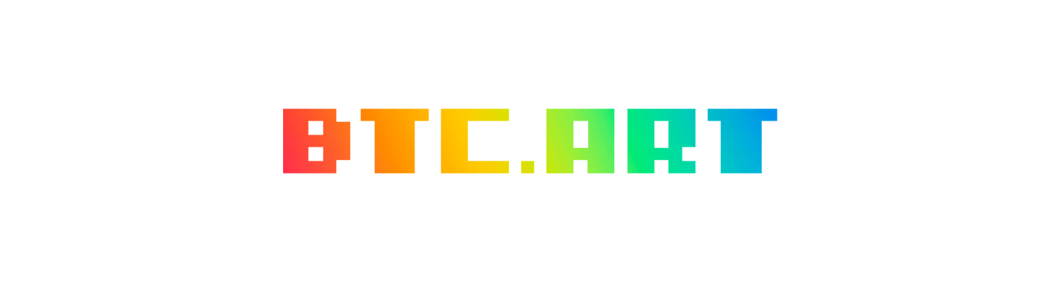
The wordmark is set in a pixel typeface and rendered in a spectrum gradient — structure meets colour, code meets creativity.

The wordmark is set in I pixel u — a typeface built on a strict pixel grid. Every letterform is constructed from uniform square units, giving the mark a systematic, engineered quality that echoes the deterministic logic of blockchain protocols.
| Property | Value |
|---|---|
| Typeface | I pixel u (Regular) |
| Size | 227.29 pt |
| Leading | 63.09 pt |
| Tracking | 95% |
| Vertical Scale | 100% |
The gradient spans the visible spectrum from crimson through to cyan — a reference to the full range of creative expression the platform enables. Applied as a continuous horizontal sweep, it transforms the rigid pixel grid into something luminous and alive.
| # | Hex | Name |
|---|---|---|
| 1 | #FF363F | Crimson |
| 2 | #FF711B | Orange |
| 3 | #FFB600 | Amber |
| 4 | #DEDE00 | Lime |
| 5 | #95EE3B | Emerald |
| 6 | #00E28F | Teal |
| 7 | #01ABDF | Cyan |
The gradient does not follow individual letterforms — it flows through them as a continuous band, suggesting art that transcends its medium.
Each character is built from the same base pixel unit. The typeface's rigid constraints produce distinctive forms — the symmetrical counters in B and A, the minimal period glyph acting as the domain separator, and the open counter of C suggesting digital openness.
| Glyph | Character |
|---|---|
| B | Mirrored counters. Heaviest glyph in the set. |
| T | Crossbar + central stem. Architectural, symmetrical. |
| C | Open counter on the right. Suggests digital openness. |
| . | Single pixel unit. Pure signal — the domain separator. |
| A | Open base with central crossbar. |
| R | Closed upper counter with descending leg. |
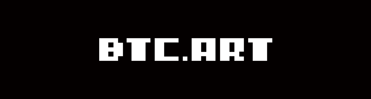
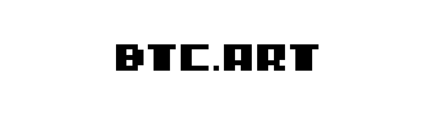
The wordmark is supplied in four treatments. The gradient version is the primary mark; mono versions are provided for contexts where colour reproduction is limited.
The brand gradient extends to interactive elements as a hover state — fill, text, or border — reinforcing the identity across all UI touchpoints.
View Collection Submit WorkTerms of Service — Privacy Policy — Contact
Help CentreAt a glance:
| Treatment | Class | Use |
|---|---|---|
| Fill | rainbow-hover | Primary actions, CTAs |
| Text | rainbow-text | Inline links, navigation |
| Border | rainbow-border | Secondary actions, settings |
Maintain a clear space zone equal to the cap height (x) around all sides of the wordmark. This ensures legibility and breathing room in all applications.
| Context | Minimum Size |
|---|---|
| Screen | 24px cap height |
| 8mm cap height |
| Role | Name |
|---|---|
| Art Direction, Design | Lukeabc |