The OGsBrand Identity |
Client | FAR | |
|---|---|---|---|
| Discipline | Art Direction, Design | ||
| By | LUKEABC | Date | 2025 |
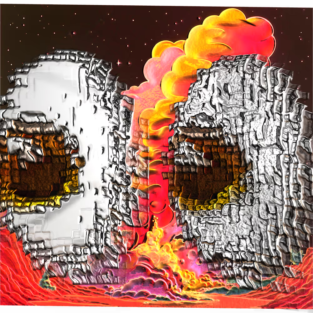
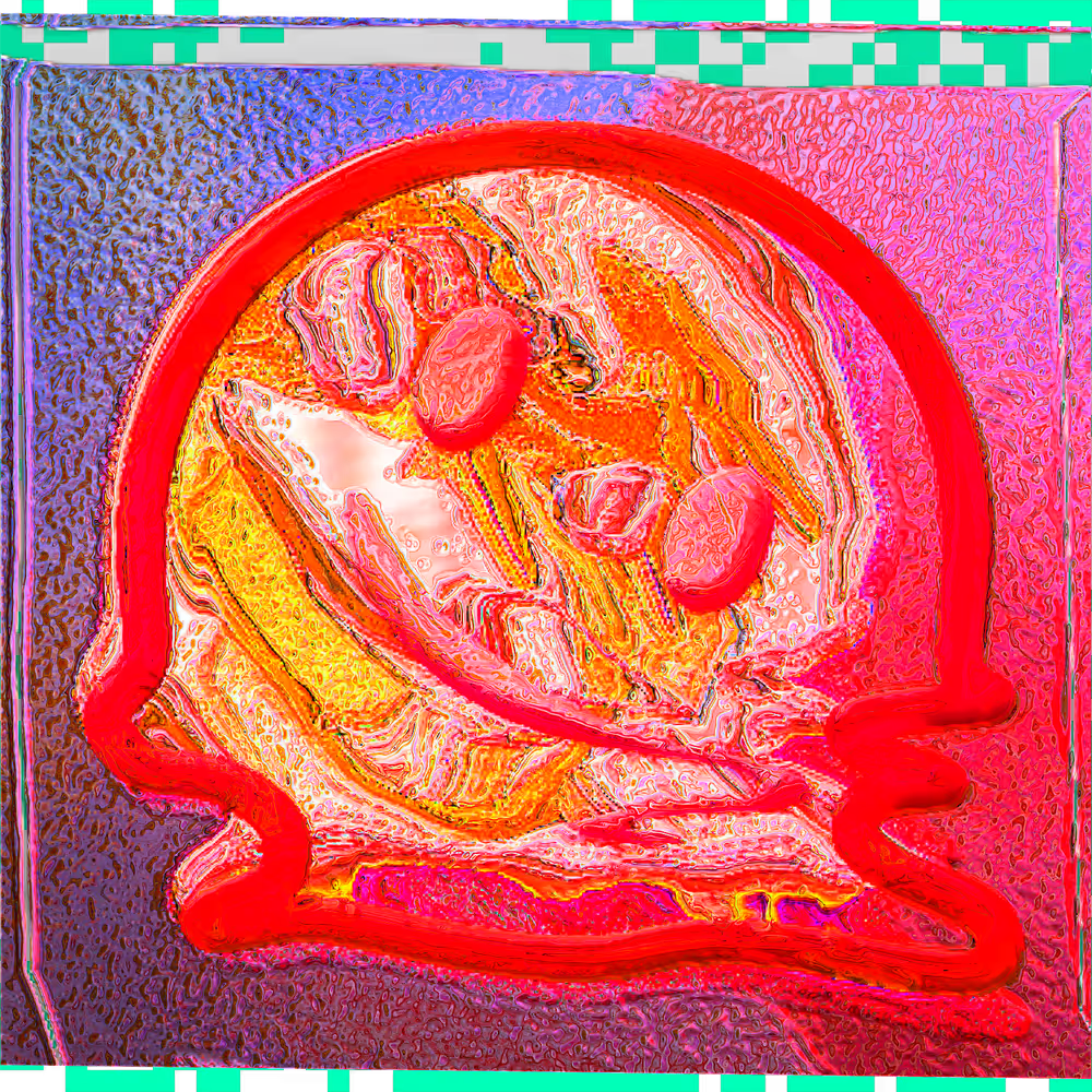
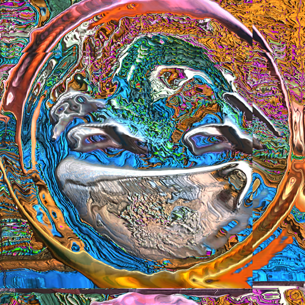
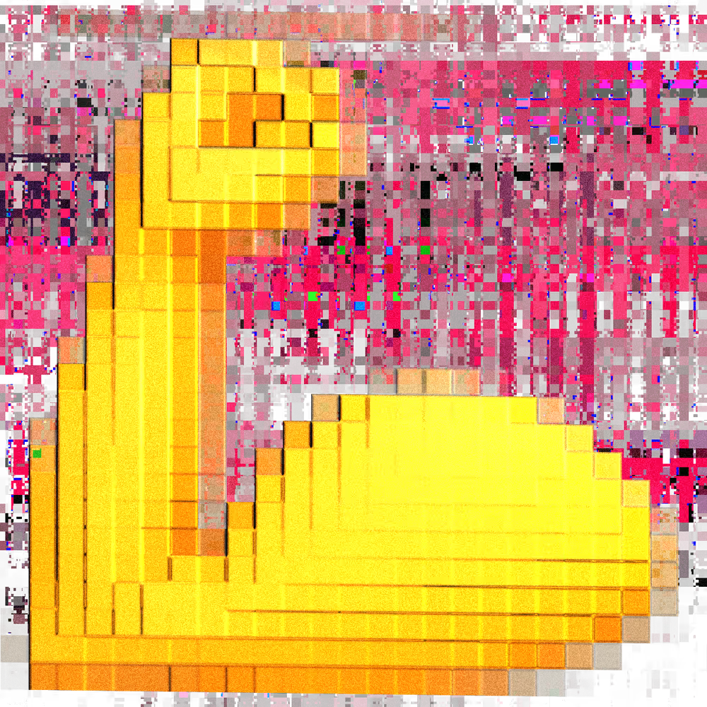
Brand identity for The OGs, a series of 1,024 digital paintings by FAR that reimagine emojis as painterly digital relics. Each work begins as a hand-drawn emoji, then gets rebuilt through algorithms that distort, warp and layer it into something between painting and code.
The project name is a play on OGs and em-O-gees — so the identity needed to live in that same space: familiar symbols, remixed beyond recognition.
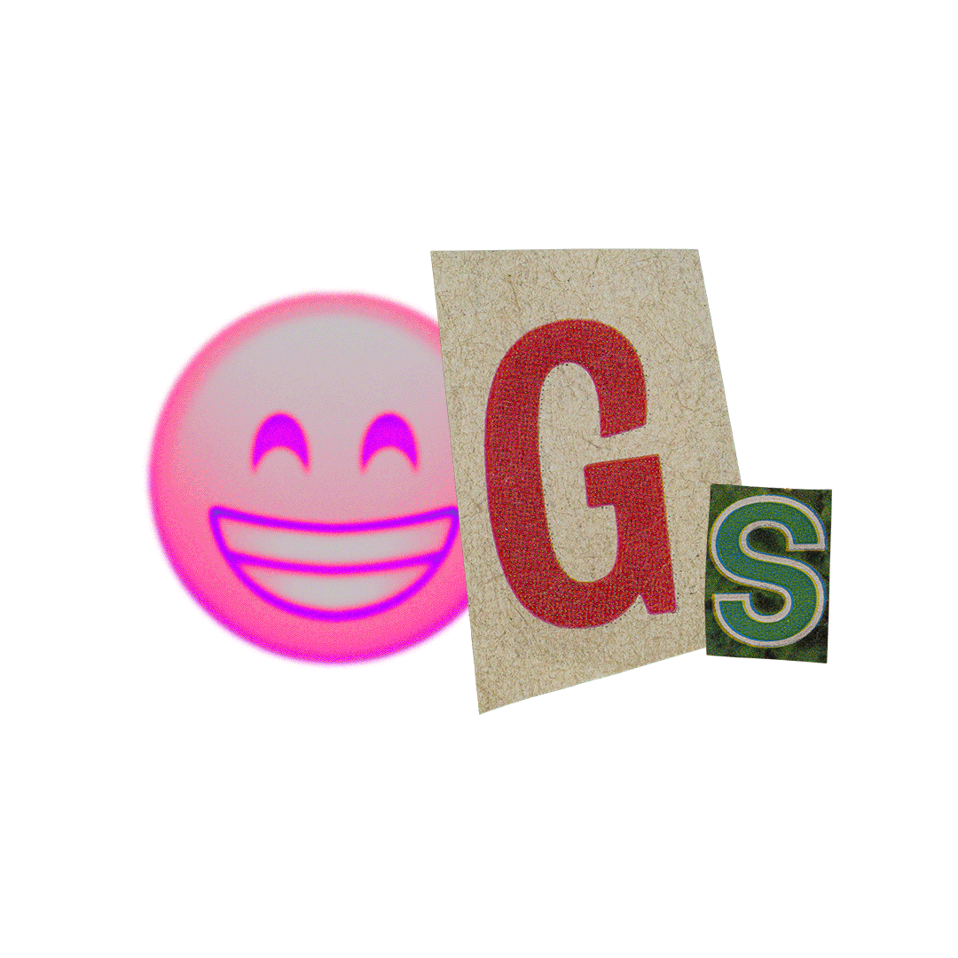
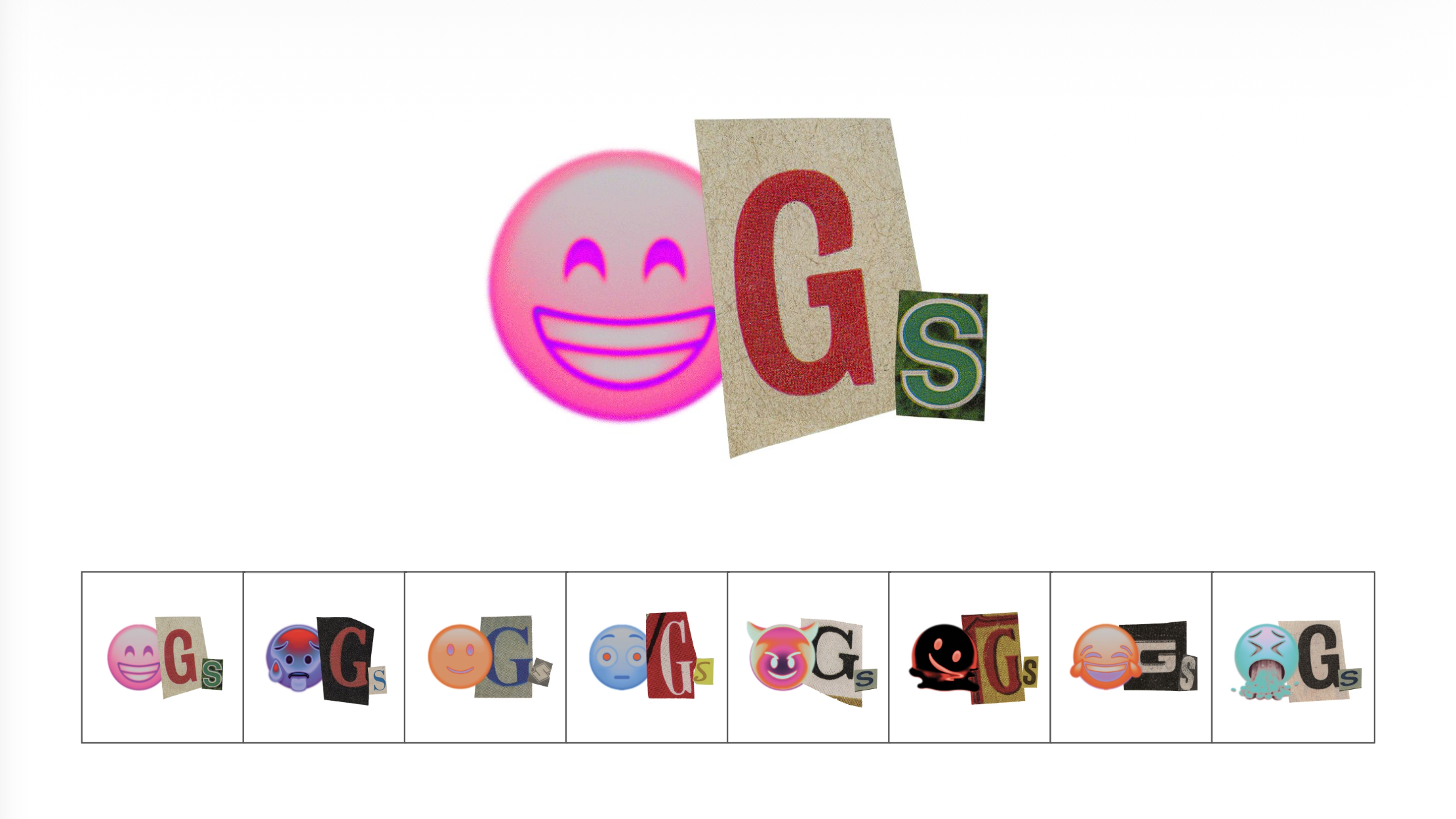
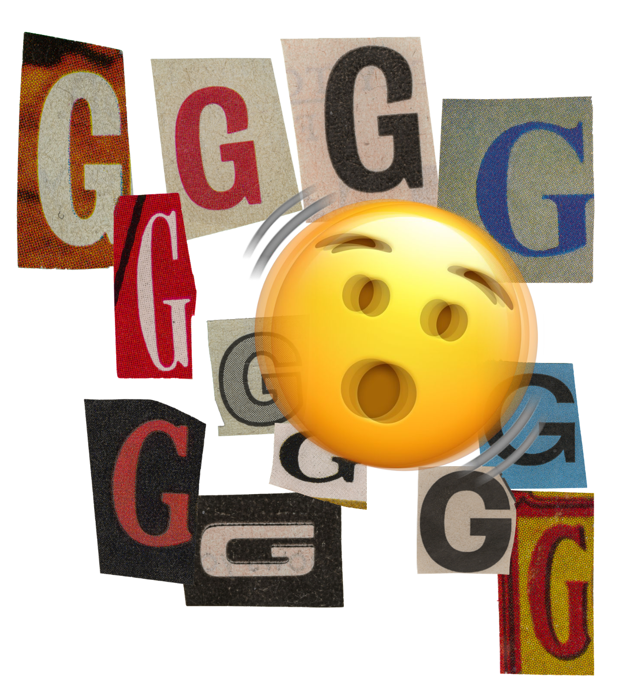
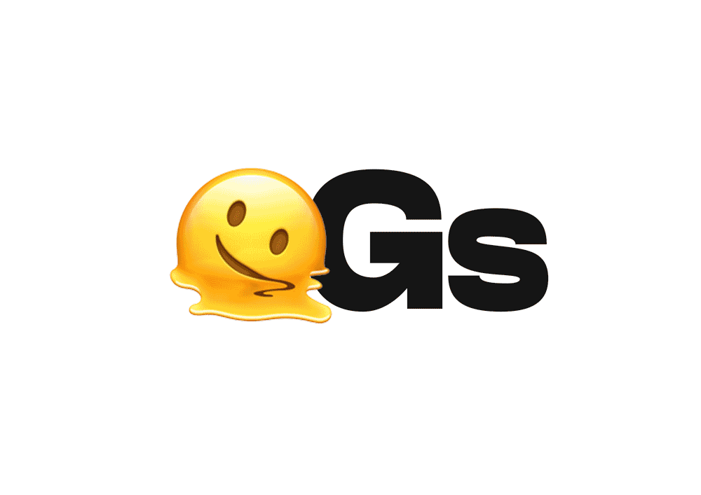
The logo replaces the O in OGs with an emoji — any emoji. The G and S are cut-out letterforms in different typefaces, scales and textures, assembled like a ransom note. Every combination is different. A generative logo for a generative art collection.
The system mirrors the artwork's own logic: take something universal, remix it, and make it strange. The result is an identity that never looks the same twice but always reads as the same thing.
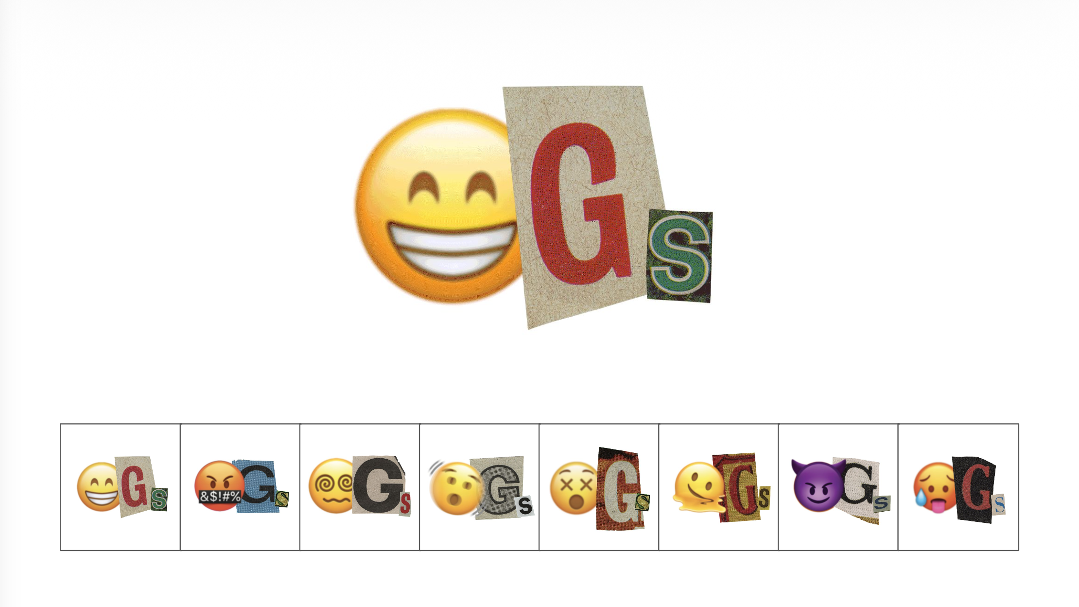
A clean lockup also exists for simpler applications — bold sans-serif with a single emoji as the O. Both registers work within the same logic.
The artworks themselves: emojis as cultural fossils, run through layers of drawing, computation and digital painting. Visually rooted in early web aesthetics and post-internet art.
| Role | Name |
|---|---|
| Art Direction, Design | Lukeabc |
| Year | 2025 |